Noosa Springs

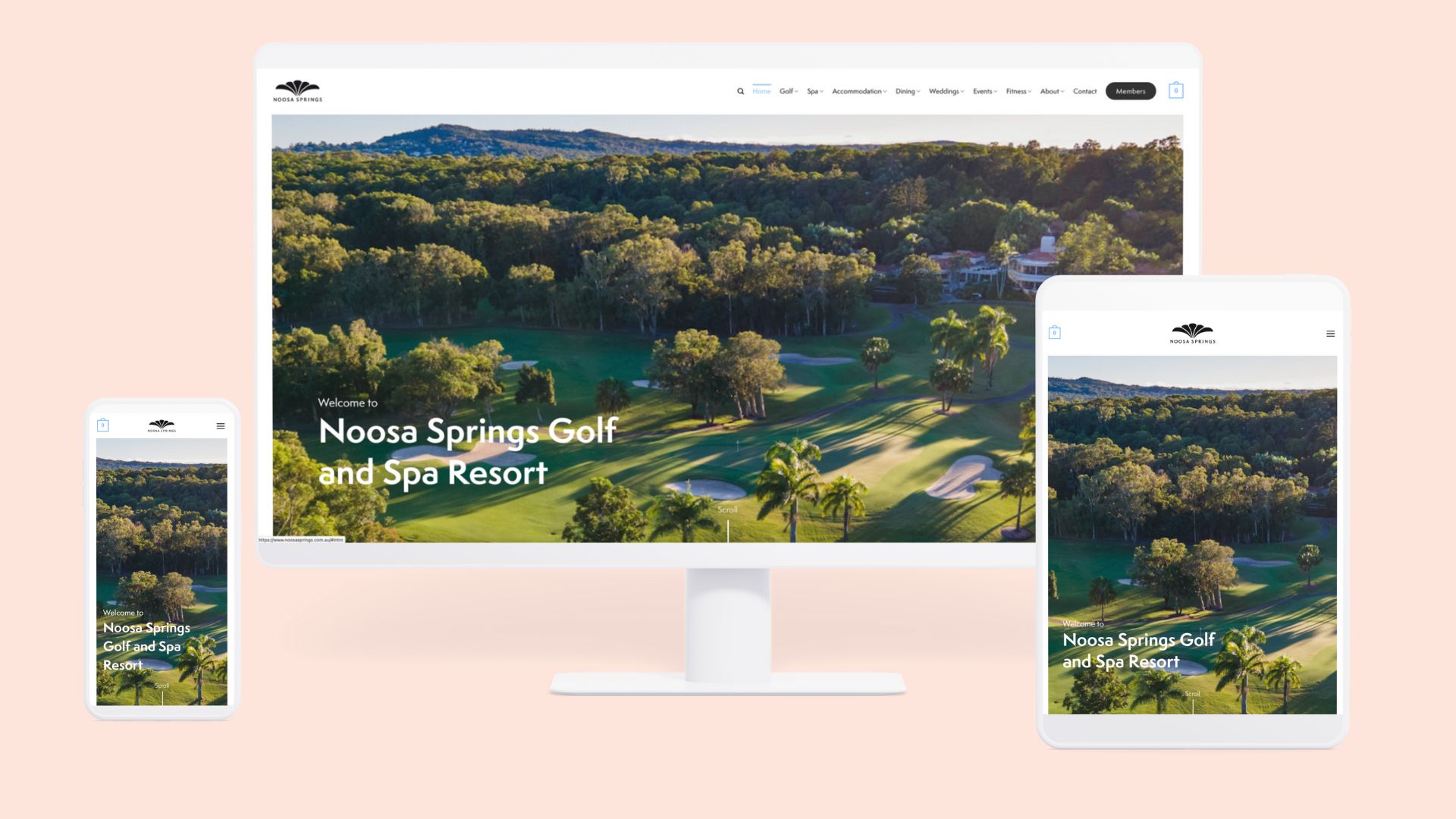
While working with Social Tap, I had the opportunity to redesign and develop the website for Noosa Springs, a luxurious resort offering golf, spa treatments, fitness, dining, and accommodation. The goal was to create a clean and classy website that would reflect the resort's elegance and Tuscan-style architecture, replacing their outdated site with a modern, user-friendly experience.

Objectives

  1. Aesthetic Appeal: Develop a visually appealing website that embodies the Tuscan style of the resort.
  2. User Experience: Ensure the website is easy to navigate, with relevant information easily accessible.
  3. Brand Identity: Select custom fonts and colors that reflect the resort's luxurious and Italian-inspired atmosphere.

Design and Development Process

Brand Identity

Custom Colors:

Inspired by Tuscan colors, we chose:
Sky Blue (#93C5EC): Evoking the serene and clear skies of Tuscany, this color adds a fresh and calming element to the design.
Warm Peach (#F9A986): Reflecting the warm, earthy tones of Tuscan landscapes, this color brings a cozy and welcoming feel to the site.

Fonts
To complement the resort's Tuscan architecture, we selected the custom font Semplicità Pro. This elegant and timeless typeface ties perfectly with the Italian-inspired design, adding a touch of sophistication to the website.

User Experience and Structure

Analyzing Page Views and Structure

Given the extensive content and numerous pages of the old website, I conducted a thorough analysis of page views and user behavior. This analysis helped me identify the most visited and essential pages, ensuring that these were prominently featured and easy to access.

Clean and Classy Design

The redesigned website features a clean layout with ample white space, allowing the content to breathe and enhancing readability. High-quality images of the resort, showcasing its stunning Tuscan architecture and lush surroundings, are prominently displayed to attract potential guests.

User-centric Approach

The new design caters to a diverse range of demographics, including golf enthusiasts, spa and wellness seekers, families, couples, business travelers, international visitors, and event planners. Each user group can easily access tailored information, such as detailed descriptions of golf packages, spa treatments, family-friendly amenities, romantic getaways, corporate facilities, multilingual support, and event planning resources. By focusing on these varied needs, we ensured an inclusive and user-friendly experience that aligns with Noosa Springs' luxurious brand identity.

Conclusion

The Noosa Springs website redesign and development project successfully transformed an outdated site into a clean, classy, and user-friendly platform. By incorporating a custom font and colors inspired by Tuscan architecture, and by carefully analyzing and restructuring the site's content, we created a digital presence that reflects the elegance and sophistication of the resort. This project not only enhanced the aesthetic appeal of the website but also significantly improved the user experience, making it easier for visitors of all demographics to explore and enjoy all that the resort has to offer.

Ready to create your own immersive digital experience?

Fill out the form or email me directly at deb@webvdev.com with ideas, questions or requests.
 WebVdev 2021
cross