The Website
The Website redesign included a brand new header, as well as a new hero and testimonials sections. It also featured a total redesign of the listings and single listing pages.
Here as well, accessibility is key so contrast is really high and
buttons are easy to find and access. The Cérge avatar is also used to
break up the 2D of the webpage in the spirit of Japanese Manga.
A new design sprint will feature a new page about business and a revisited navigation.
A new design sprint will feature a new page about business and a revisited navigation.
The Tablet App
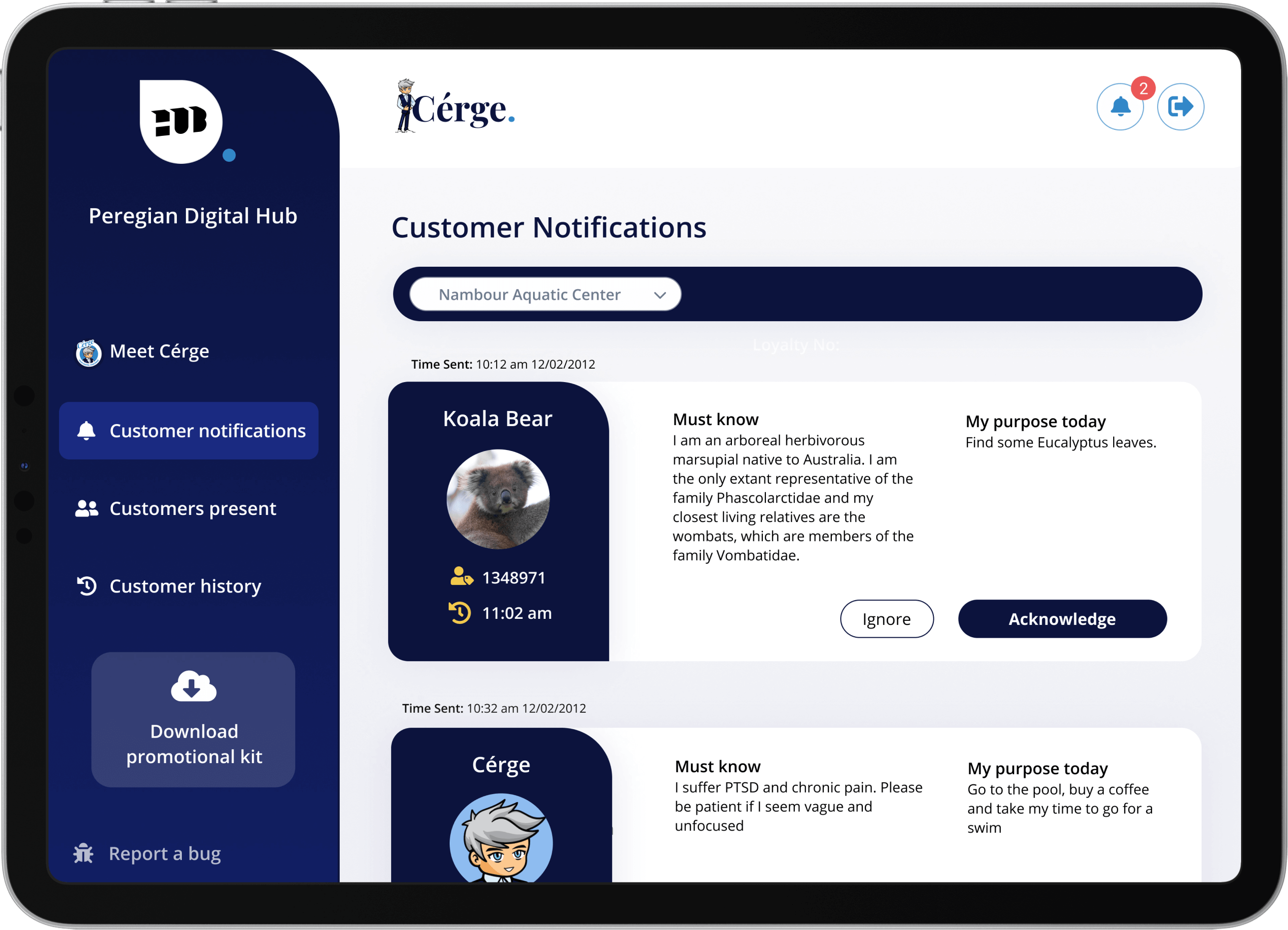
After some field research we realized some businesses didn't have the use of a computer at all times and would need another solution to be able to use Cérge easily. We decided a tablet App would be necessary.
The main challenge here was moving away from the Web Portal design and adapting it to a totally different experience on tablets.
To achieve that we kept the rounded designs but we also decided to introduce curves to create an experience that is unique to the tablet App, while being consistent with the brand identity.
To achieve that we kept the rounded designs but we also decided to introduce curves to create an experience that is unique to the tablet App, while being consistent with the brand identity.

Collaterals
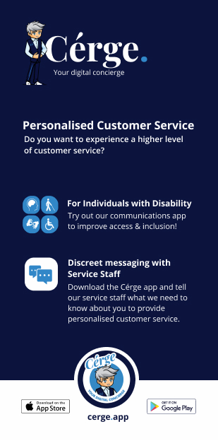
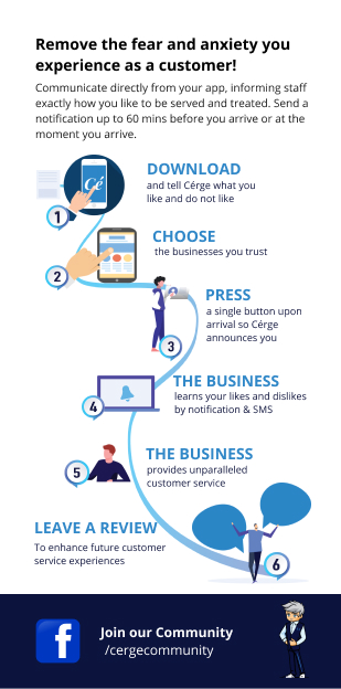
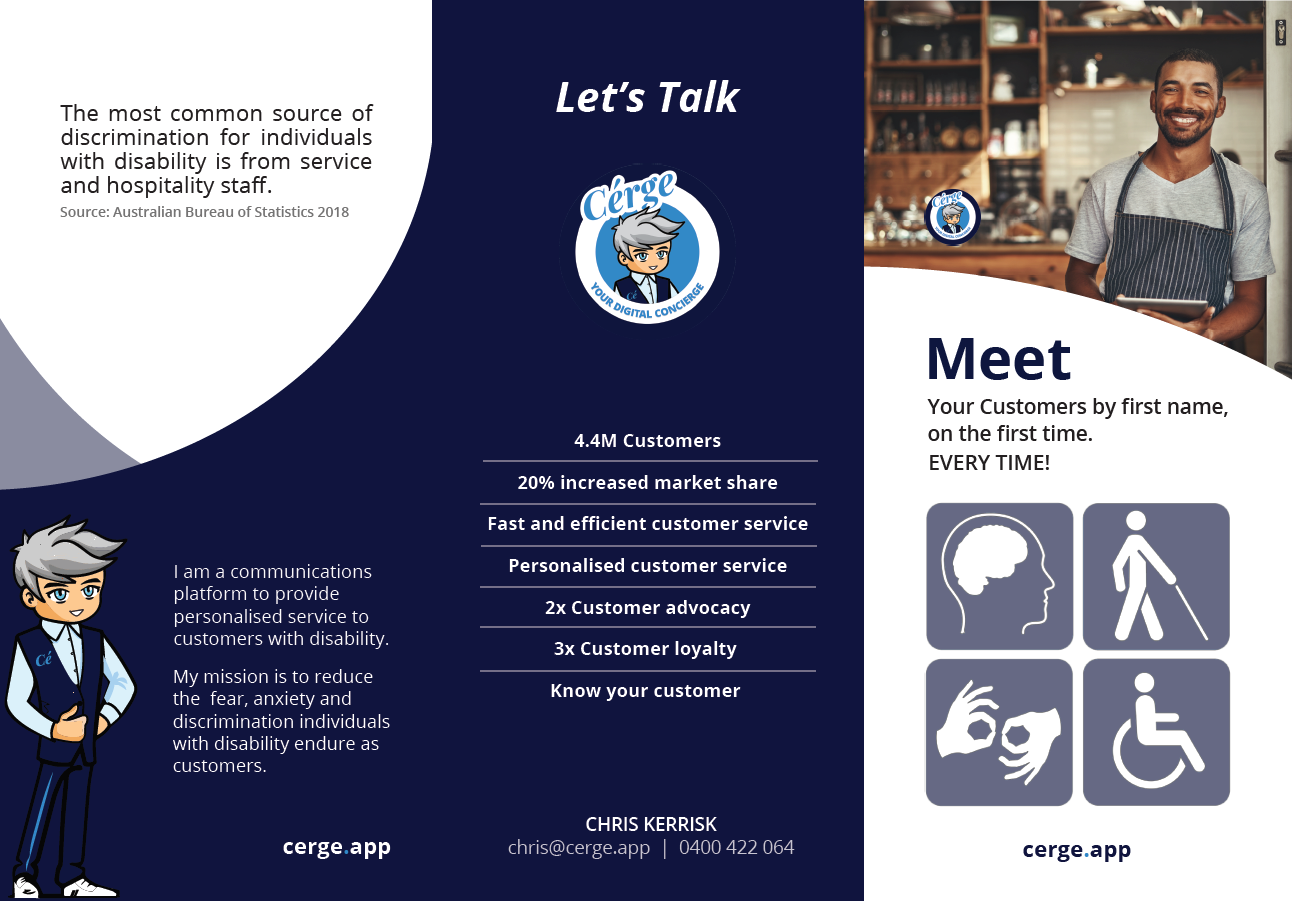
Collaterals included customer and business flyers, posters, banners and presentations. They were a great design challenge as print design is always so different from digital.
A very important part of design is identifying what the message of a
specific asset is and convey it to someone glancing at it, which is why
bold text was chosen in order to capture attention.


